Code Sample: Generating Manhattan Plots in R
A useful way to summarize genome-wide association data is with a Manhattan plot. This type of plot has a point for every SNP or location tested with the position in the genome along the x-axis and the -log10 p-value on the y-axis.
Manhattan Plotting Function
Here is a function which can make a Manhattan plot using lattice graphics. While the function itself is quite long, you don't have to worry about most of it. You really only need to pay attention to the parameters that you pass to the funciton. An example of its use is given below.
library(lattice)
manhattan.plot<-function(chr, pos, pvalue,
	sig.level=NA, annotate=NULL, ann.default=list(),
	should.thin=T, thin.pos.places=2, thin.logp.places=2,
	xlab="Chromosome", ylab=expression(-log[10](p-value)),
	col=c("gray","darkgray"), panel.extra=NULL, pch=20, cex=0.8,...) {

	if (length(chr)==0) stop("chromosome vector is empty")
	if (length(pos)==0) stop("position vector is empty")
	if (length(pvalue)==0) stop("pvalue vector is empty")

	#make sure we have an ordered factor
	if(!is.ordered(chr)) {
		chr <- ordered(chr)
	} else {
		chr <- chr[,drop=T]
	}

	#make sure positions are in kbp
	if (any(pos>1e6)) pos<-pos/1e6;

	#calculate absolute genomic position
	#from relative chromosomal positions
	posmin <- tapply(pos,chr, min);
	posmax <- tapply(pos,chr, max);
	posshift <- head(c(0,cumsum(posmax)),-1);
	names(posshift) <- levels(chr)
	genpos <- pos + posshift[chr];
	getGenPos<-function(cchr, cpos) {
		p<-posshift[as.character(cchr)]+cpos
		return(p)
	}

	#parse annotations
	grp <- NULL
	ann.settings <- list()
	label.default<-list(x="peak",y="peak",adj=NULL, pos=3, offset=0.5,
		col=NULL, fontface=NULL, fontsize=NULL, show=F)
	parse.label<-function(rawval, groupname) {
		r<-list(text=groupname)
		if(is.logical(rawval)) {
			if(!rawval) {r$show <- F}
		} else if (is.character(rawval) || is.expression(rawval)) {
			if(nchar(rawval)>=1) {
				r$text <- rawval
			}
		} else if (is.list(rawval)) {
			r <- modifyList(r, rawval)
		}
		return(r)
	}

	if(!is.null(annotate)) {
		if (is.list(annotate)) {
			grp <- annotate[[1]]
		} else {
			grp <- annotate
		}
		if (!is.factor(grp)) {
			grp <- factor(grp)
		}
	} else {
		grp <- factor(rep(1, times=length(pvalue)))
	}

	ann.settings<-vector("list", length(levels(grp)))
	ann.settings[[1]]<-list(pch=pch, col=col, cex=cex, fill=col, label=label.default)

	if (length(ann.settings)>1) {
		lcols<-trellis.par.get("superpose.symbol")$col
		lfills<-trellis.par.get("superpose.symbol")$fill
		for(i in 2:length(levels(grp))) {
			ann.settings[[i]]<-list(pch=pch,
				col=lcols[(i-2) %% length(lcols) +1 ],
				fill=lfills[(i-2) %% length(lfills) +1 ],
				cex=cex, label=label.default);
			ann.settings[[i]]$label$show <- T
		}
		names(ann.settings)<-levels(grp)
	}
	for(i in 1:length(ann.settings)) {
		if (i>1) {ann.settings[[i]] <- modifyList(ann.settings[[i]], ann.default)}
		ann.settings[[i]]$label <- modifyList(ann.settings[[i]]$label,
			parse.label(ann.settings[[i]]$label, levels(grp)[i]))
	}
	if(is.list(annotate) && length(annotate)>1) {
		user.cols <- 2:length(annotate)
		ann.cols <- c()
		if(!is.null(names(annotate[-1])) && all(names(annotate[-1])!="")) {
			ann.cols<-match(names(annotate)[-1], names(ann.settings))
		} else {
			ann.cols<-user.cols-1
		}
		for(i in seq_along(user.cols)) {
			if(!is.null(annotate[[user.cols[i]]]$label)) {
				annotate[[user.cols[i]]]$label<-parse.label(annotate[[user.cols[i]]]$label,
					levels(grp)[ann.cols[i]])
			}
			ann.settings[[ann.cols[i]]]<-modifyList(ann.settings[[ann.cols[i]]],
				annotate[[user.cols[i]]])
		}
	}
 	rm(annotate)

	#reduce number of points plotted
	if(should.thin) {
		thinned <- unique(data.frame(
			logp=round(-log10(pvalue),thin.logp.places),
			pos=round(genpos,thin.pos.places),
			chr=chr,
			grp=grp)
		)
		logp <- thinned$logp
		genpos <- thinned$pos
		chr <- thinned$chr
		grp <- thinned$grp
		rm(thinned)
	} else {
		logp <- -log10(pvalue)
	}
	rm(pos, pvalue)
	gc()

	#custom axis to print chromosome names
	axis.chr <- function(side,...) {
		if(side=="bottom") {
			panel.axis(side=side, outside=T,
				at=((posmax+posmin)/2+posshift),
				labels=levels(chr),
				ticks=F, rot=0,
				check.overlap=F
			)
		} else if (side=="top" || side=="right") {
			panel.axis(side=side, draw.labels=F, ticks=F);
		}
		else {
			axis.default(side=side,...);
		}
	 }

	#make sure the y-lim covers the range (plus a bit more to look nice)
	prepanel.chr<-function(x,y,...) {
		A<-list();
		maxy<-ceiling(max(y, ifelse(!is.na(sig.level), -log10(sig.level), 0)))+.5;
		A$ylim=c(0,maxy);
		A;
	}

	xyplot(logp~genpos, chr=chr, groups=grp,
		axis=axis.chr, ann.settings=ann.settings,
		prepanel=prepanel.chr, scales=list(axs="i"),
		panel=function(x, y, ..., getgenpos) {
			if(!is.na(sig.level)) {
				#add significance line (if requested)
				panel.abline(h=-log10(sig.level), lty=2);
			}
			panel.superpose(x, y, ..., getgenpos=getgenpos);
			if(!is.null(panel.extra)) {
				panel.extra(x,y, getgenpos, ...)
			}
		},
		panel.groups = function(x,y,..., subscripts, group.number) {
			A<-list(...)
			#allow for different annotation settings
			gs <- ann.settings[[group.number]]
			A$col.symbol <- gs$col[(as.numeric(chr[subscripts])-1) %% length(gs$col) + 1]
			A$cex <- gs$cex[(as.numeric(chr[subscripts])-1) %% length(gs$cex) + 1]
			A$pch <- gs$pch[(as.numeric(chr[subscripts])-1) %% length(gs$pch) + 1]
			A$fill <- gs$fill[(as.numeric(chr[subscripts])-1) %% length(gs$fill) + 1]
			A$x <- x
			A$y <- y
			do.call("panel.xyplot", A)
			#draw labels (if requested)
			if(gs$label$show) {
				gt<-gs$label
				names(gt)[which(names(gt)=="text")]<-"labels"
				gt$show<-NULL
				if(is.character(gt$x) | is.character(gt$y)) {
					peak = which.max(y)
					center = mean(range(x))
					if (is.character(gt$x)) {
						if(gt$x=="peak") {gt$x<-x[peak]}
						if(gt$x=="center") {gt$x<-center}
					}
					if (is.character(gt$y)) {
						if(gt$y=="peak") {gt$y<-y[peak]}
					}
				}
				if(is.list(gt$x)) {
					gt$x<-A$getgenpos(gt$x[[1]],gt$x[[2]])
				}
				do.call("panel.text", gt)
			}
		},
		xlab=xlab, ylab=ylab,
		panel.extra=panel.extra, getgenpos=getGenPos, ...
	);
}
Sample Usage
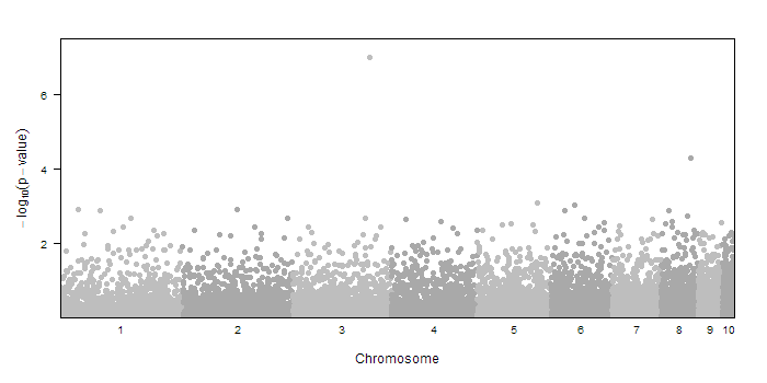
First, let us create some fake data to test it with. We will use an imaginary animal that has 10 autosomes. The random sample data is created with
#FAKE SAMPLE DATA
createSampleGwasData<-function(chr.count=10, include.X=F) {
	chr<-c(); pos<-c()
	for(i in 1:chr.count) {
		chr <- c(chr,rep(i, 1000))
		pos <- c(pos,ceiling(runif(1000)*(chr.count-i+1)*25*1e3))
	}
	if(include.X) {
		chr <- c(chr,rep("X", 1000))
		pos <- c(pos,ceiling(runif(1000)*5*25*1e3))
	}
	pvalue <- runif(length(pos))
	return(data.frame(chr, pos,pvalue))
}
dd<-createSampleGwasData()
dd$pvalue[3000] <- 1e-7 #include a significant result
Using this sample data (chr, pos, and pvalue) we can make the manhattan plot by calling
manhattan.plot(dd$chr, dd$pos, dd$pvalue)
That's it! But if that were all the function could do, it would be much shorter. There are many other parts of the plot that you can customize.
The sig.level= parameter allows you to draw a dotted line indicating the genome-wide significance threshold for your data. If you leave out that parameter, no line will be drawn. A common option would be to incluide sig.level=5e-8 for a genome-wide association study.
Notice how the colors alternate between chromosomes. You can change these colors with the col= parameter. You need to pass in a vector of R colors. For example, if you want a more festive plot, try col=c("orange","blue","purple").
By default the function attempts to minimize the number of points drawn by rounding the -log10 p-value and the position and then only plotting the unique combinations. You can disable this default behavior by specifying should.thin=F when you call the function. You can also contol the level of thinning by setting thin.pos.places= and thin.logp.places=. These values control the number of decimal places that each value is rounded to. Both of these values default to 2 decimal places.
Furthermore, you are able to pass any additional lattice graphical parameters that you want as well such as main=, ylim=, or par.settings=. They will be passed though to the embded xyplot() command.
If your list of chromosomes is non-numeric, you need to bit of extra work. You must make sure the value you pass in for chromosome is an ordered factor, such that chromosomes 1-22 come first, followed by X,Y, and/or MT. An example might be
#generate sample data (with X) using above function
dd<-createSampleGwasData(include.X=T)
#now plot chromosomes in correct order
manhattan.plot(factor(dd$chr, levels=c(1:10, "X")), dd$pos, dd$pvalue)
Noteice that the labels on the x-axis in the plot come from the levels of the chr factor. Thus if you have raw data that has chromosomes 1-25 where stands for 23=X, 24,Y, and 25=MT, you can create the appropriate ordered vector with the proper names using factor(chr, levels=1:25, labels=c(1:22, "X","Y","MT")) where chr is your vector of values 1-25.
In tests, running R to read in GWAS results (2.5 million SNPs) and create a manhattan plot using this function took about 7-10 minutes. The only real concern is how much memory R uses when you read in the data. It is important to only read in the data that you need for the plot to minimize memory; so if your results file contains other columns, you may wish to ignote them using a NULL in colClasses= (see the documentation for read.table for more information).
Annotating Regions or SNPs
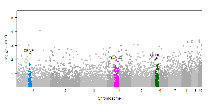
The mantahhan.plot function provies many options for annotating differnt parts of your plot. For example you may wish to highlight certain gene regions or point out certain SNPs. You can do this with the annotate= parameter. In the simplest case, you can pass in a factor (with the same length as the pvalue vector) which assigns each point to a group. The function assumes the first level of that factor correspondes to the background SNPs, and every other factor will be drawn in a different color, and labeled with their lable name. (Note: you can check the levels and labels of a factor variable in R with levels() and labels()). Here is an example of coloring in three gene regions
#create sample data
dd<-createSampleGwasData()
#make annotation factor
ann<-rep(1, length(dd$pvalue))
ann[with(dd, chr==1 & pos>=90e3 & pos<110e3)]<-2
ann[with(dd, chr==4 & pos>=50e3 & pos<80e3)]<-3
ann[with(dd, chr==6 & pos>=30e3 & pos<50e3)]<-4
ann<-factor(ann, levels=1:4, labels=c("","GENE1","GENE2", "GENE3"))
#draw plot with annotation
manhattan.plot(dd$chr, dd$pos, dd$pvalue, annotate=ann)
Notice that the new regions (those other than the first level of the factor) are colored accooring to the default trellis superpose.symbol colors. However, you have a lot of control over how these special regions are drawn and labeled. Rather than passing in a factor to annotate=, you can pass in a list containing your factor as well as additional lists to customize the drawing of each of the different regions. Each region has the following settings:
list(col= pch=, cex=, fill=,
	label=list(text=, x=,y=,adj=, pos=, offset=,
		col=, fontface=, fontsize=, show=)
)
All of these parmeters have there usual meaning for plotting functions (see ?xyplot or ?ltext for more information on these parameters). So when building a list for your annotation, your factor must come first, then you can also pass in lists corresponding to each level of your factor (including the background SNPs) that contain the values you want to override. Alternatively, you can pass in lists with names corresponding to the labels of your factor. Let's illustrate with some examples. Say we wanted to change the plotting character of GENE2 to be trangles, we can either do
manhattan.plot(dd$chr, dd$pos, dd$pvalue,
    annotate=list(ann, list(), list(), list(pch=17), list()))
#or
manhattan.plot(dd$chr, dd$pos, dd$pvalue,
    annotate=list(ann, "GENE2"=list(pch=17)))
Notice in the first example, there are four list() items in the annotate list, each corresponse to the four levels of the ann factor. In the second example, we specifically set properties for just the "GENE2" level.
So we can also customize how the labels are displayed. You can change the text with any of the following parameters
	annotate=list(ann, "GENE2"=list(label="Other Name"))
	#or
	annotate=list(ann, "GENE2"=list(label=list(text="Other Name")))
or you can turn off labeling with either of the following
	annotate=list(ann, "GENE2"=list(label=F))
	#or
	annotate=list(ann, "GENE2"=list(label=list(show=F)))
Further more, you can specify an x= and y= value ```in a label list``` to control where the label is placed. For x=, you can speicfy an chromosome and position in the format x=list(chr,pos) or you can specify "center" to find the x-value that's in the exact middle of the region, or "peak" to get the x-value at the SNP with the most significant p-value. The default is "peak". For the y= parameter, you can specify a -log10 pvalue (not just the regualr pvalue) or "peak" to get the -log10 pvalue for the best SNP in the region. All of these are valid locations:
	annotate=list( ann, "GENE2"=list(label=list(x="center")) )
	annotate=list( ann, "GENE2"=list(label=list(x="peak", y=7)) )
	annotate=list( ann, "GENE2"=list(label=list(x=list(3,5e3))) )
The default position for the label, in reference to the (x,y) point, is pos=3 which indicates the label is to be centered above the point. If you want this to be even a bit higher than than point, you can also increase the offset with offset=2 or something similar. For more info on these options, see ?text. Here is what the list might locate if we wanted to change the color of a gene region and mvoe the label somewhat:
annotate=list( ann, "GENE2"=list(col="green", label=list(x="center", offset=2)) )
The defaults for the first level are taken from the pch= and col= parameters you pass to the function. If you want to change the defaults for the additional gene regions, you can set the ann.default= parameter. These are the settings applied to the regions before any of the settings you might specify in the annotate= parameter. For example, if you wanted to make all the highlighed regions use triangles, rather than circles, you could run
manhattan.plot(dd$chr, dd$pos, dd$pvalue, annotate=ann, ann.default=list(pch=17))
Annotation Helper Function
While you have a lot of options to put together an annotation list, there are some types of annotations that are quite standard. To help with these cases, you may use this annotateSNPRegions() function to easily create annotations around SNPs.
annotateSNPRegions<-function(snps, chr, pos, pvalue, snplist,
	kbaway=0, maxpvalue=1, labels=c(), col=c(), pch=c()) {

	stopifnot(all(length(snps)==length(chr), length(chr)==length(pos),
		length(pos)==length(pvalue)))
	if (length(snplist)==0) stop("snplist vector is empty")

	if(any(pos>1e6)) kbaway<-kbaway*1000

	ann<-rep(0, length(snps))
	for(i in seq_along(snplist)) {
		si<-which(snps==snplist[i])
		ci<-chr[si]
		pi<-pos[si]
		ann[chr==ci & pos >= pi-kbaway & pos <= pi+kbaway & pvalue<=maxpvalue]<-i
	}
	ann<-list(factor(ann, levels=0:length(snplist), labels=c("", snplist)))
	if(length(col)>0 || length(pch)>0 || length(labels)>0) {
		for(i in seq_along(snplist)) {
			ann[[ snplist[i] ]] = list()
			if(length(col)>0) {
				ann[[ snplist[i] ]]$col = col[ (i-1) %% length(col)+1 ]
			}
			if(length(pch)>0) {
				ann[[ snplist[i] ]]$pch = pch[ (i-1) %% length(pch)+1 ]
			}
                        if(length(labels)>0) {
                                ann[[ snplist[i] ]]$label = labels[ (i-1) %% length(labels)+1 ]
                        }
		}
	}
	return(ann)
}
To use this function, you must pass in snp names, chromosome, position, and pvalue. Then you must specify a list of SNPs that you want to use to identify your regions. Then you can optionally specify a color (col=) or plotting character (pch=) to use for those regions. If you give more than one color (for example), those colors will be cycled over all of the regions. If you supply only one color, the same color will be used for all regions
We can show how to use this function with sample sample data. Here is an example where we identiy 3 gene regions:
#generate fake data
dd<-createSampleGwasData()
dd$snp <- paste("rs", 1:length(dd$pvalue), sep="") #make up SNP names
#create annotations
ann<-annotateSNPRegions(dd$snp, dd$chr,dd$pos,dd$pvalue,
	c("rs10", "rs1001", "rs2005"),
	labels=c("GENE1","GENE2","GENE3"),
	col="blue",
	kbaway=100
)
#draw plot
manhattan.plot(dd$chr, dd$pos, dd$pvalue, annotate=ann)
A final example
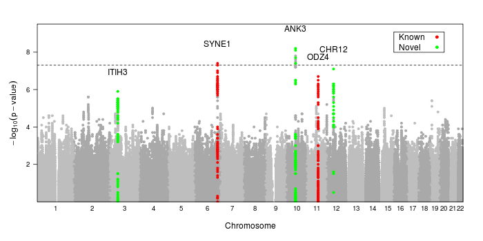
Here is the code used to create the image at the top of the page
dd<-read.table("/path/to/data.txt", header=T, as.is=T, sep="\t")
ann<-annotateSNPRegions(dd$MarkerName, dd$CHR, dd$POS, dd$P.value,
    snplist=c("rs10994397","rs7296288","rs736408","rs9371601", "rs12576775"),
    name=c("ANK3","CHR12","ITIH3","SYNE1","ODZ4"),
    col=c("green","red")[c(1,1,1,2,2)], kbaway=50
)
png("mh.png", width=950, height=400)
print(manhattan.plot(dd$CHR, dd$POS, dd$P.value,
	annotate=ann, ann.default=list(label=list(offset=2)),
	sig.level=5e-8,
	key=list(background="white", border=T, padding.text=2,
	corner=c(.95, .95), text=list(lab=c("Known","Novel")),
	points=list(col=c("red","green"), pch=20))
	)
)
dev.off()
Note that we use the built-in lattice parameter key= to create a color key for our gene regions. We cannot use auto.key= or simpleKey() since this technique uses groups differently than standard Lattice does in order to provide greater flexibility.
Creating Image Files
If you have a lot of data, drawing the image to the screen may take a long time, even with the default thinning. Similarly, if you write the image to a PDF, you will get a larger image size and it may take a long time to open/print since the location of every point is stored in the PDF. If you create a PNG file, the image size will be a lot smaller since it remembers the final pixels of the image rather than all the points it drew to make those pixels. If you make the image large enough, you probably won't notice much loss of detail either. Something like
png("mymanhattan.png", width=950, height=500)
print(manhattan.plot(chr, pos, pvalue, sig.level=5e-8))
dev.off()
should work well.
Alternatives
Note that Cristen Willer and Serena Sanna have also made many beautiful plots for GWAS data using R base graphics. They have provided a sample script that does many of the same things as the above function, plus takes care of reading in the data, highlighting known SNPs, and making QQ plots. The sample code can be found at
snowwhite:/home/cristen/scripts/makeplot_manhattan_qq_forsharing.R


