Bar Harbor Statistical Genetics Workshop
Summary
This workshop was prepared for the 51st Mammalian Genetics Short Course, at the Jackson Laboratory in Bar Harbor. It illustrates several simple analyses of genetic association studies (we are necessarily limited by time!).
Example Data Set
This example examines evidence for association between fasting glucose levels and genetic markers in the G6PC2 (chr. 2), GCK (chr. 7) and MTNR1B (chr. 11) regions. It uses results from 3 genomewide association studies: FUSION, SardiNIA and DGI. Genetic variants in the three loci impact fasting glucose levels and, in the case of MTRN1B, also impact the risk of type 2 diabetes.
We will examine evidence for association in three short regions that show evidence for association with glucose levels (Chen et al, Journal of Clinical Investigation, 2008; Prokopenko et al, Nature Genetics, 2009). These regions map near theG6PC2 (chr. 2), GCK (chr. 7) and MTNR1B (chr. 11) genes. Results for markers within several hundred kilobases of these regions were genotyped or imputed in the FUSION (Scott et al, Science, 2007), DGI (Diabetes Genetics Initiative, Science, 2007), and SardiNIA (Scuteri et al, PLoS Genetics, 2007) genomewide association studies and are tabulated in the three files below:
DGI_three_regions.txt
FUSION_three_regions.txt
SARDINIA_three_regions.txt
For convenience, a zip archive that includes all three files is also available.
Generating a Q-Q Plot
One of the most common analysis in a genomewide association is to generate a Q-Q plot which compares observed test statistics with those expected to occur by chance when a similar number of markers is examined. The approach works because in a GWAS we expect that the vast majority of variants will show no evidence of association with the trait of interest. For this exercise, you should pick one of the three datasets above and load into an appropriate statistical package (like R). If no suitable statistical package is available, Microsoft Excel will do.
Here are the basic steps you will need to carry out to generate a Q-Q plot:
- Count the number of markers being examined. Let's call this number M.
- Sort observed p-values, from smallest to largest.
- Match each expected p-value with an expected p-value, which is simply its rank divided by M.
- Plot expected p-values along the X axis and actual p-values along the X-axis.
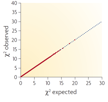
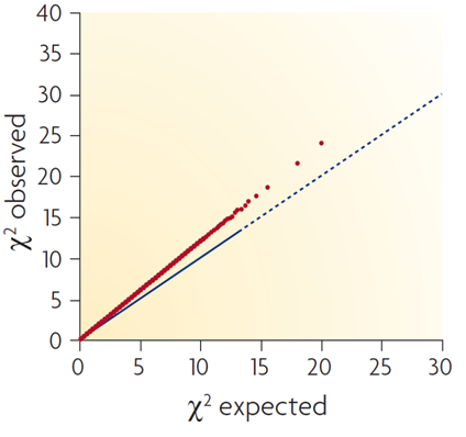
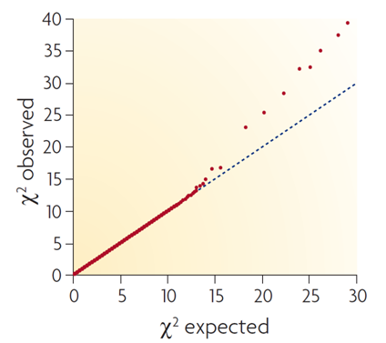
Compare your generated Q-Q plot with the three examplar plots below:
This first plot represents a null setting, where test statistics appear well behaved, but there is no evidence for association.
This second plot represents a problematic situation, where it is very clear that test statistics don't match null expectations.
This final plot represents an ideal situation, where the majority of markers reassuringly fit null expectations and a small number of markers (perhaps tagging elusive loci impacting the trait of interest) show evidence for association.


